Insights for ArcGIS is an application which allows individuals to visually tell stories with their data. We can move away from a dataset of rows and columns, and turn this into something we can analyse more efficiently. This blog will run through some of the tips and tricks I’ve picked up after using the application.
Symbology made simple
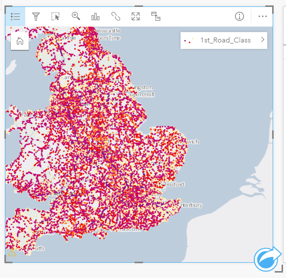
If you have already been creating maps and visualisations in ArcGIS Pro or ArcGIS Online, you’ll be pleased to know that Insights retains the symbology styles you’ve previously been using. This can be important for instantly being familiar with a dataset.
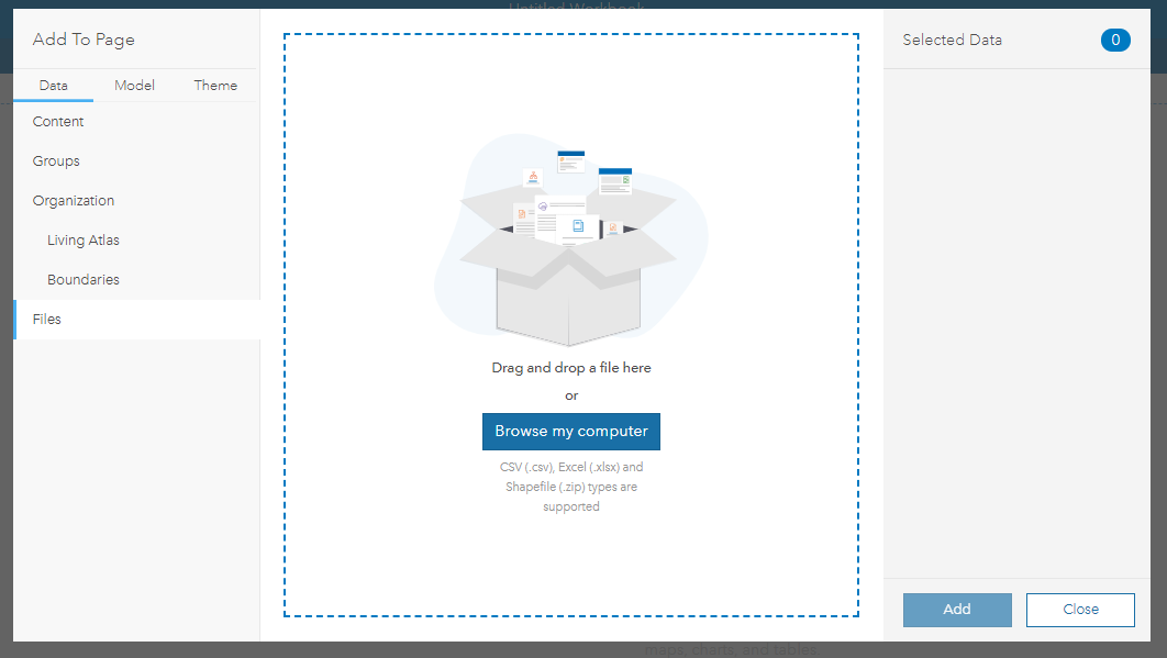
If you haven’t yet mapped your data, Insights provides a great starting point for analysis. You can upload data from within the application itself which could be spatial or tabulated; this also enables you to easily geocode addresses within the application.
Visualisations suitable for different occasions
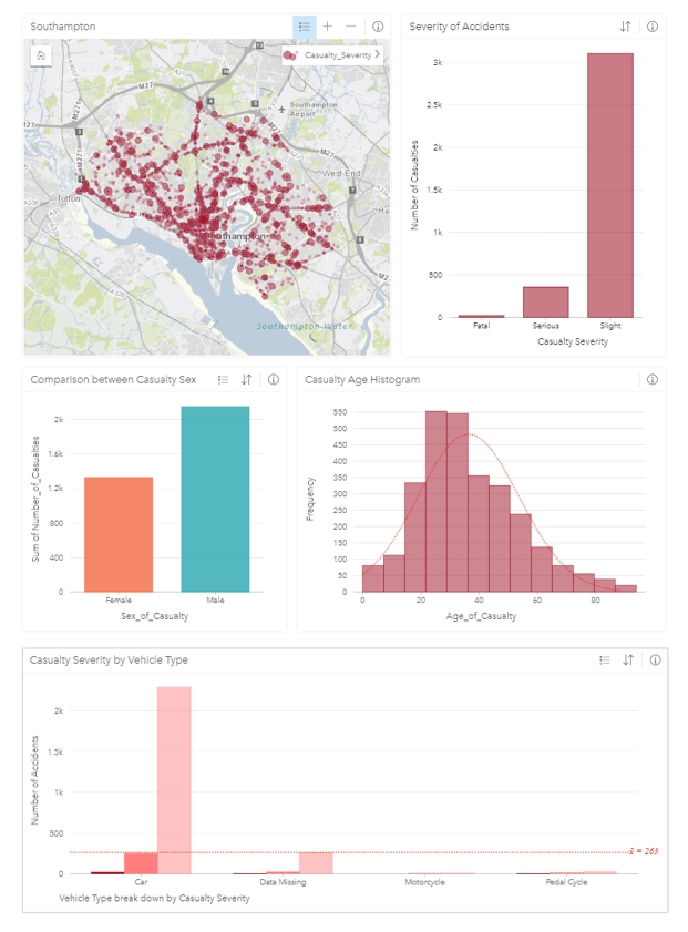
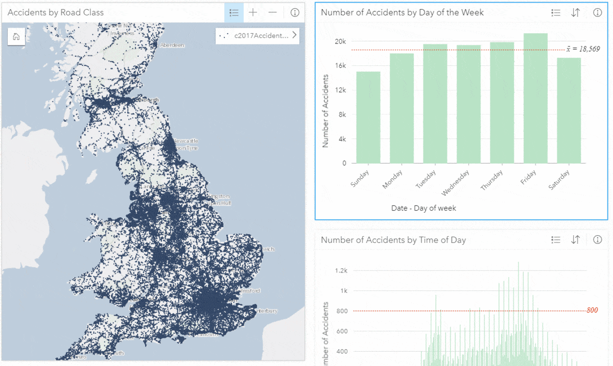
The learning curve is much shallower for Insights than traditional GIS tools. It provides the ability to share an interactive version of your dataset giving users one-click options to filter between maps and various graphs and charts. Traditional filtering such as this is based upon variable characteristics, e.g. temporal filtering by date:
This ease of use and sharing means that it meets the demands of experienced data analysts and those new to visualisation applications.
Insights also allows individuals to keep adding cards below and to the side of the initial view; this approach makes you think about comparison visualisations and is suitable for developing a cohesive story from data. There is no need to worry about running out of room!
Note - If you ever make a mistake when you move a card it’s good to keep in your back pocket the ability to undo with Ctrl + Z.
Interacting with data is important, but sometimes you’ve made a visualisation which you’d like to share with a team who aren’t as comfortable with the technology. In this instance you can share a static print-out of a workbook. You can choose to save this as a PDF or as an image for adding directly into a report.
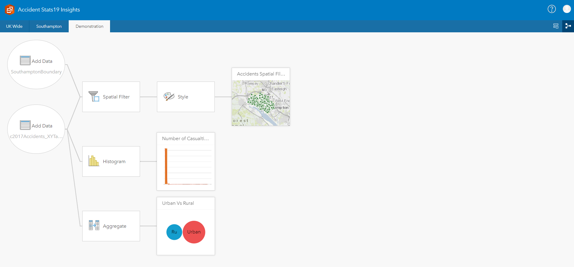
Model View
The model view can be selected at the top right of an Insights workbook. It allows you to quickly update data visualisations by choosing different filters and fields to view, even after the creation of each style and layout. For repeat analysis, it is possible to replicate workbooks or drag and drop datasets from one page to another. A use case for this might be the requirement to create monthly reports from a continually updated dataset.
After using the spatial filter tool to hone in on a study area, you can then use the model view to duplicate the workbook and update the spatial extent - without interfering with the layout of the data visualisations.