I decided on density based clustering. For this I chose to convert the polygon features into points. This meant leaving a point in the middle of each polygon representing the function of the green space itself. A relatively simple exercise to enable you to perform some form of clustering on polygon data.
5 to 10 minutes
Using the Select By Attributes tool I was able to separate each function (Golf Courses, Tennis Courts and Bowling Greens) from the full set of points. Each needed to be exported separately with the Feature Class to Feature Class tool in order to keep them manageable.
10 to 20 minutes
The next ten minutes involved creating the background tessellation. I already had a UK shapefile depicting the outline of the country and using the Generate Tessellation tool I created 25 km hex bins which I thought was just about small enough to still be visible at a national scale.
Note — I actually made 10km hex bins first which wasted a couple of minutes as they were way too small to be able to actually see any of the hexagonal pattern. I could also have used one of the hexbin sets in the Living Atlas.
I wanted to include some regional boundaries in my hex map. I used the Dissolve tool to merge the 25km hex bins in order to create outlines around NUTS 3 (Nomenclature of Territorial Units for Statistic) boundaries. I made sure to do this on a copy of the main 25km hex bins as I’ve made that mistake one to many times before. The main reason for using these over counties was that the field was already present in the UK shapefile that I was using as a background. This boundary was enough to split the country up into regions for added context.
The last step in the process was performing three separate Spatial Joins in order to attach the feature points representing each green space type. This meant that there was a Join field within the attribute table which could be used to symbolise the data.
I used the final 10 minutes to pick colours and create a quick layout for the three maps.
I copied each map within the Catalogue pane, this meant that I could then symbolise each in the same way but for the three different green space types - without affecting the scale at which they would be presented.
I chose a simple colour ramp going from transparent green to a darker green for the highest density areas. There wasn’t too much of a need to include a legend in this map as it is quite a straightforward approach to density. If you remove the outline colour from any of these you can make them fade into each other. I was basing this upon a previous effect I’d seen used by John Nelson in his drought map.
The final layer list for each was super simple, consisting of only two layers:
-
Dissolved NUTS 3 boundaries
-
Density hex bins for each activity
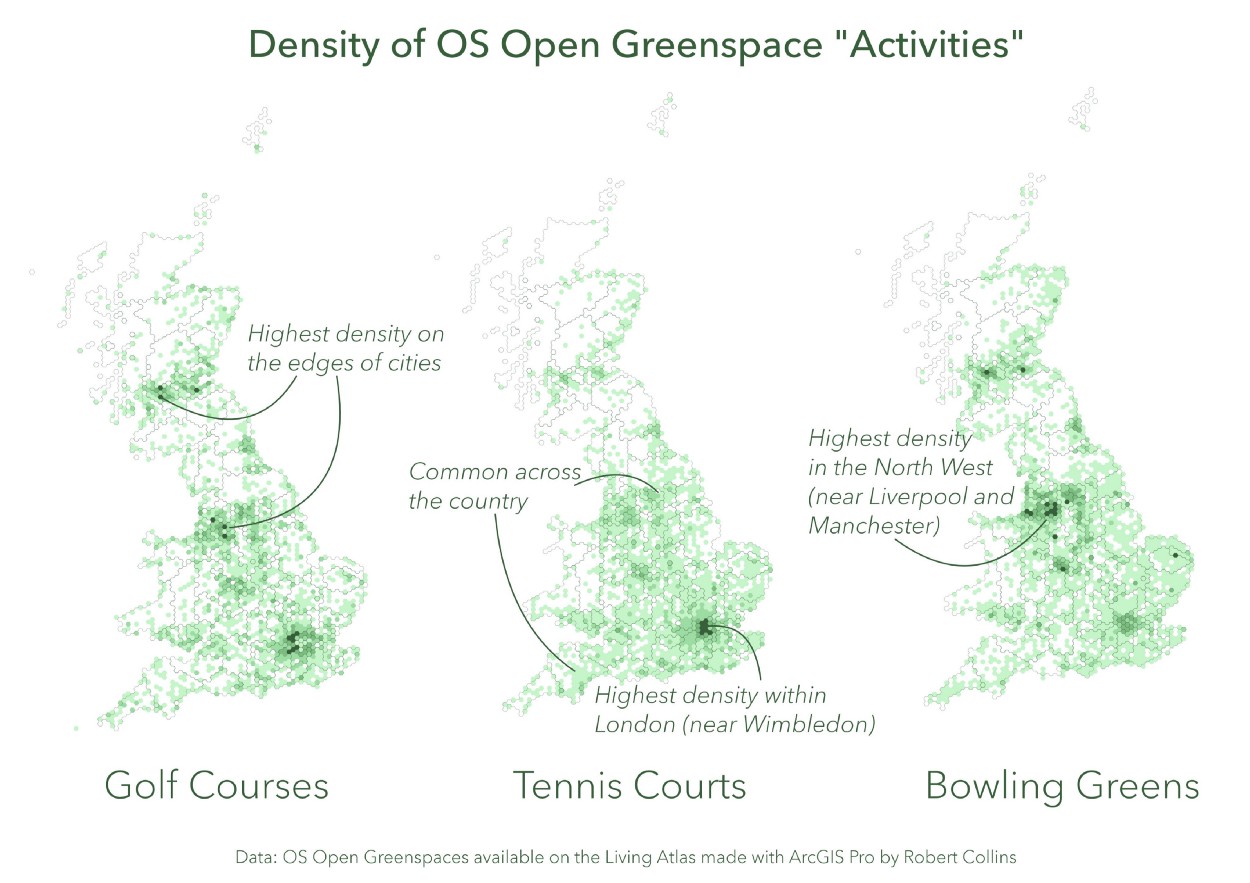
Having each map separated, meant I could create a map frame in the layout and then copy it twice - just replacing the map in view. I added some text in the areas that I thought were important, naming each map and adding details about the dataset. Otherwise three similar maps wouldn’t have proved that effective.
I had about 2 minutes left and decided to add curved lines to areas of each map which were interesting at first glance. You’ll notice that these normally just refer to the areas of highest density. This was because I was running out of time at the end.
Hopefully this inspires you to take up the 30 minute map challenge in the future.